找到
14
篇与
HTML
相关的结果
- 第 2 页
-
 社会主义核心价值观-代码 AI摘要:本文介绍了社会主义核心价值观的代码实现,包括HTML代码,展示了国家、社会和个人层面的价值观内容,强调践行这些价值观对国家富强、社会和谐和个人全面发展的意义。效果图 000043图片 演示地址 代码 HTML代码 - <!DOCTYPE html> <html lang="zh-CN"> <head> <meta charset="UTF-8"> <meta name="viewport" content="width=device-width, initial-scale=1.0"> <title>社会主义核心价值观</title> <link href="http://api.xunjinlu.fun/css/shehuizhuyihexinjiazhiguan.css" rel="stylesheet"> <style> body { font-family: 'Noto Sans SC', Arial, sans-serif; margin: 0; padding: 0; background-color: #ffffff; color: #333; display: flex; justify-content: center; align-items: center; min-height: 100vh; flex-direction: column; } .container { max-width: 800px; padding: 20px; background-color: #ffffff; box-shadow: 0 2px 10px rgba(0, 0, 0, 0.1); border: 3px solid #d32f2f; border-radius: 10px; } h1 { color: #d32f2f; text-align: center; margin-bottom: 20px; font-size: 2.5em; } h2 { color: #b71c1c; margin-top: 20px; margin-bottom: 10px; border-bottom: 2px solid #b71c1c; padding-bottom: 5px; font-size: 1.8em; } p { line-height: 1.8; margin-bottom: 15px; font-size: 1.2em; } .values { display: flex; justify-content: space-around; margin-top: 20px; margin-bottom: 20px; flex-wrap: wrap; /* 允许内容换行 */ } .values div { text-align: center; width: 30%; background-color: #fbe9e7; border: 2px solid #b71c1c; border-radius: 10px; padding: 10px; box-shadow: 0 4px 6px rgba(0, 0, 0, 0.1); margin-bottom: 20px; /* 增加块之间的间距 */ transition: transform 0.3s; } @media (max-width: 768px) { .values div { width: 100%; /* 在手机界面上每个块占据整个行 */ } } .footer { text-align: center; padding: 15px; margin-top: 20px; color: #fff; background-color: #d32f2f; border-top: 3px solid #b71c1c; border-radius: 0 0 10px 10px; font-size: 1.2em; } .footer p { margin: 5px 0; } .footer small { display: block; margin-top: 10px; font-size: 0.9em; color: #f0f0f0; } </style> </head> <body> <div class="container"> <h1>社会主义核心价值观</h1> <p>社会主义核心价值观是中国共产党在新时期提出的重要指导思想,是社会主义现代化建设的重要精神<a href="/"target="_blank" style="color:#17202a;text-decoration: none;">支</a>柱。每个公民应当积极践行社会主义核心价值观,共建美好社会。</p> <h2>核心价值观内容</h2> <div class="values"> <div> <h3><a href="/" target="_blank" style="color: #d32f2f;text-decoration: none;">国家层面</a></h3> <p>富强、民主、文明、和谐</p> </div> <div> <h3><a href="/" target="_blank" style="color: #d32f2f;text-decoration: none;">社会层面</a></h3> <p>自由、平等、公正、法治</p> </div> <div> <h3><a href="/" target="_blank" style="color: #d32f2f;text-decoration: none;">个人层面</a></h3> <p>爱国、敬业、诚信、友善</p> </div> </div> <h2>应用和意义</h2> <p>社会主义核心价值观是每个公民应当遵循的道德准则,有助于推动国家富强,社会和谐,个人全面发展。通过践行这些价值观,我们可以共同为实现中华民族伟大复兴的中国梦贡献力量。</p> <div class="footer"> <p>践行社会主义核心价值观,共建美好未来</p> <small>© 2024 尋鯨錄 <br> <a href="https://beian.miit.gov.cn/" target="_blank" style="color: #f0f0f0;text-decoration: none;">滇ICP备2023007716号-1</a> <br> <a href="https://beian.mps.gov.cn/#/query/webSearch" target="_blank" style="color: white; text-decoration: none;"> <img src="https://beian.mps.gov.cn/img/logo01.dd7ff50e.png" alt="公安备案图标" style="vertical-align: middle; height: 15px; width: auto; margin-right: 5px;">公安备案号:滇公网安备53032202530370号</a> </small> </div> </div> </body> </html> 演示地址
-
聚光灯效果-HTML AI摘要:本文介绍了如何使用HTML和CSS实现聚光灯效果,通过设置背景渐变和裁剪路径,使文字产生动态的聚光灯效果。效果图 000032图片 代码 HTML+CSS - html <!DOCTYPE html> <html lang="zh-CN"> <head> <meta charset="UTF-8" /> <meta name="viewport" content="width=device-width, initial-scale=1.0" /> <title>HTML+CSS — 聚光灯</title> <link rel="stylesheet" href="index.css" /> </head> <body> <h1>Happy Birthday</h1> </body> </html> css * { padding: 0; margin: 0; } body { display: flex; justify-content: center; align-items: center; height: 100vh; background-color: #000; } h1 { position: relative; /* 1rem=16px */ font-size: 8rem; color: #333; } h1:after { content: 'Happy Birthday'; position: absolute; top: 0; left: 0; /* 透明色 */ color: transparent; background-image: linear-gradient(to right, #c23616, #192a56, #00d2d3, yellow, #6d214f, #2e86de,#4cd137, #e84118); /* 背景绘制区域,值为text时,给文字设置镂空效果,前提必须是文字颜色为透明色 */ background-clip: text; /* 谷歌浏览器私有属性 */ -webkit-background-clip: text; /* 使用裁切方法创建元素的可显示区域 circle表示裁切一个圆形 100px表示圆的直径 0%和50%表示圆心位置 直径和圆心两组值中间用at隔开*/ clip-path: circle(100px at 0% 50%); -webkit-clip-path: circle(100px at 0% 50%); animation: move 5s infinite; } @keyframes move { 0% { clip-path: circle(100px at 0% 50%); -webkit-clip-path: circle(100px at 0% 50%); } 50% { clip-path: circle(100px at 100% 50%); -webkit-clip-path: circle(100px at 100% 50%); } 100% { clip-path: circle(100px at 0% 50%); -webkit-clip-path: circle(100px at 0% 50%); } }
-
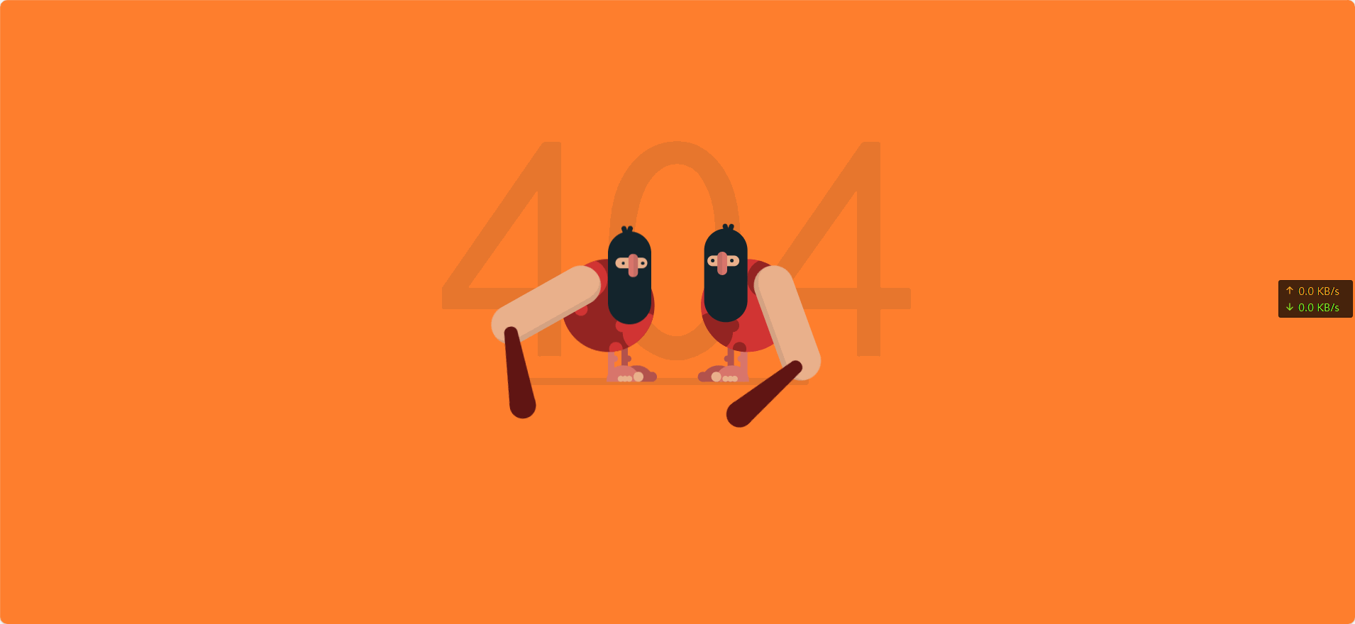
动态404页面 AI摘要:创建了一个动态的404页面,包含两个山顶洞人形象,通过HTML和CSS实现,包含动画效果。效果图 000030图片 演示站点-404 代码 代码 - HTML <!DOCTYPE html> <html lang="cn" > <head> <meta charset="UTF-8"> <title>404 error</title> <link rel="stylesheet" href="1.css"> </head> <body> <div class="text"><p>404</p></div> <div class="container"> <div class="caveman"> <div class="leg"> <div class="foot"><div class="fingers"></div></div> </div> <div class="leg"> <div class="foot"><div class="fingers"></div></div> </div> <div class="shape"> <div class="circle"></div> <div class="circle"></div> </div> <div class="head"> <div class="eye"><div class="nose"></div></div> <div class="mouth"></div> </div> <div class="arm-right"><div class="club"></div></div> </div> <div class="caveman"> <div class="leg"> <div class="foot"><div class="fingers"></div></div> </div> <div class="leg"> <div class="foot"><div class="fingers"></div></div> </div> <div class="shape"> <div class="circle"></div> <div class="circle"></div> </div> <div class="head"> <div class="eye"><div class="nose"></div></div> <div class="mouth"></div> </div> <div class="arm-right"><div class="club"></div></div> </div> </div> </body> </html> CSS body { background-color: #FF7F2E; font-family: "Concert One", cursive; margin: 0; overflow: hidden; padding: 0; } /*/////////////////// 规则 */ /*/////////////////// 场景 */ .text { left: 50%; position: absolute; top: 50%; transform: translate(-50%, -50%); color: rgba(19, 36, 44, 0.1); font-size: 30em; text-align: center; top: 40%; } .container { left: 50%; position: absolute; top: 50%; transform: translate(-50%, -50%); height: 300px; width: 500px; } .container:after { position: absolute; content: ""; background-color: rgba(19, 36, 44, 0.1); border-radius: 12px; bottom: 40px; height: 12px; left: 80px; width: 350px; z-index: -1; } /*/////////////////// 山顶洞人 */ .caveman { height: 300px; position: absolute; width: 250px; } .caveman:nth-child(1) { right: 20px; } .caveman:nth-child(2) { left: 20px; transform: rotateY(180deg); } .head { position: absolute; background-color: #13242C; border-radius: 50px; height: 140px; left: 60px; top: 25px; width: 65px; } .head:after, .head:before { content: ""; position: absolute; background-color: #13242C; border-radius: 10px; height: 20px; width: 7px; } .head:after { left: 35px; top: -8px; transform: rotate(20deg); } .head:before { left: 30px; top: -8px; transform: rotate(-20deg); } .head .eye { left: 50%; position: absolute; transform: translateX(-50%); background-color: #EAB08C; border-radius: 50px; height: 16px; left: 45%; top: 40px; width: 48px; } .head .eye:after, .head .eye:before { content: ""; position: absolute; top: 50%; transform: translateY(-50%); background-color: #13242C; border-radius: 50%; height: 5px; width: 5px; } .head .eye:after { left: 5px; } .head .eye:before { right: 9px; } .head .eye .nose { left: 50%; position: absolute; top: 50%; transform: translate(-50%, -50%); background-color: #D9766C; border-left: 8px solid rgba(19, 36, 44, 0.1); border-radius: 10px; box-sizing: border-box; height: 35px; left: 45%; top: 12px; width: 15px; } .shape { left: 50%; position: absolute; transform: translateX(-50%); border-radius: 50%; height: 140px; overflow: hidden; top: 70px; width: 140px; } .shape .circle { position: absolute; border-radius: 50%; height: 60px; width: 60px; } .shape .circle:after, .shape .circle:before { content: ""; position: absolute; border-radius: 50%; height: 20px; width: 20px; } .shape .circle:after { left: 50px; top: 10px; } .shape .circle:before { left: 60px; top: 45px; } .shape .circle:nth-child(1) { left: -12px; top: 80px; } .shape .circle:nth-child(2) { right: 10px; top: 0px; transform: rotate(90deg); } .shape .circle:nth-child(2):after { left: 65px; top: 10px; } .shape .circle:nth-child(2):before { display: none; } .caveman:nth-child(1) .shape { background-color: #D13433; } .caveman:nth-child(1) .shape .circle { background-color: #932422; } .caveman:nth-child(1) .shape .circle:after, .caveman:nth-child(1) .shape .circle:before { background-color: #932422; } .caveman:nth-child(2) .shape { background-color: #932422; } .caveman:nth-child(2) .shape .circle { background-color: #D13433; } .caveman:nth-child(2) .shape .circle:after, .caveman:nth-child(2) .shape .circle:before { background-color: #D13433; } .arm-right { position: absolute; background-color: #EAB08C; border-left: 8px solid rgba(19, 36, 44, 0.1); border-radius: 50px; box-sizing: border-box; height: 180px; left: 135px; top: 80px; transform-origin: 30px 30px; width: 60px; z-index: 1; } .arm-right .club { position: absolute; border-bottom: 110px solid #601513; border-left: 10px solid transparent; border-right: 10px solid transparent; height: 0; left: -60px; top: 120px; transform: rotate(70deg); width: 20px; } .arm-right .club:after, .arm-right .club:before { position: absolute; content: ""; background-color: #601513; border-radius: 50%; left: 0; } .arm-right .club:after { height: 20px; width: 20px; top: -10px; } .arm-right .club:before { height: 40px; width: 40px; left: -10px; top: 90px; } .leg { position: absolute; border-radius: 10px; height: 55px; top: 200px; width: 10px; } .leg:after { position: absolute; content: ""; border-radius: 50%; height: 10px; left: -5px; top: 15px; width: 10px; } .leg .foot { position: absolute; border-radius: 25px 25px 0 0; height: 25px; left: -38px; top: 30px; width: 50px; } .leg .foot:after, .leg .foot:before, .leg .foot .fingers, .leg .foot .fingers:after { position: absolute; background-color: #EAB08C; border-radius: 50%; bottom: 0px; height: 15px; transform-origin: bottom; width: 15px; } .leg .foot:after { left: -6px; content: ""; } .leg .foot:before { left: 8px; transform: scale(0.6); content: ""; } .leg .foot .fingers { left: 15px; transform: scale(0.6); } .leg .foot .fingers:after { left: 11px; content: ""; } .leg:nth-child(1) { background-color: #B2524D; left: 95px; } .leg:nth-child(1):after { background-color: #B2524D; } .leg:nth-child(1) .foot { background-color: #B2524D; } .leg:nth-child(1) .foot:after { background-color: #B2524D; } .leg:nth-child(1) .foot:before { display: none; } .leg:nth-child(2) { background-color: #D9766C; left: 115px; } .leg:nth-child(2):after { background-color: #D9766C; } .leg:nth-child(2) .foot { background-color: #D9766C; } /*/////////////////// 动画 */ .caveman:nth-child(1) .arm-right { animation: arm-anima 1.2s infinite cubic-bezier(0.55, 0.01, 0.16, 1.34); } .caveman:nth-child(2) .arm-right { animation: arm-anima 1.2s infinite cubic-bezier(0.55, 0.01, 0.16, 1.34); animation-delay: 0.6s; } @keyframes arm-anima { 0% { transform: rotate(0); } 100% { transform: rotate(-360deg); } } .caveman:nth-child(2) .head { animation: head-anima 1.2s infinite cubic-bezier(0.55, 0.01, 0.16, 1.34); } .caveman:nth-child(1) .head { animation: head-anima 1.2s infinite cubic-bezier(0.55, 0.01, 0.16, 1.34); animation-delay: 0.6s; } @keyframes head-anima { 0% { top: 25px; } 42% { top: 25px; } 45% { top: 50px; } 100% { top: 25px; } } .caveman:nth-child(2) .eye:after, .caveman:nth-child(2) .eye:before { animation: eye-anima 1.2s infinite cubic-bezier(0.55, 0.01, 0.16, 1.34); } .caveman:nth-child(1) .eye:after, .caveman:nth-child(1) .eye:before { animation: eye-anima 1.2s infinite cubic-bezier(0.55, 0.01, 0.16, 1.34); animation-delay: 0.6s; } @keyframes eye-anima { 0% { height: 5px; } 42% { height: 5px; } 45% { height: 1px; } 100% { height: 5px; } } .container:after { animation: shadow-anima 1.2s infinite cubic-bezier(0.55, 0.01, 0.16, 1.34); animation-delay: 0.1s; } @keyframes shadow-anima { 0% { width: 350px; left: 80px; } 25% { width: 450px; left: 80px; } 50% { width: 350px; left: 80px; } 75% { width: 450px; left: 0px; } 100% { width: 350px; left: 80px; } } #link { bottom: 20px; color: #000; opacity: 0.2; display: flex; align-items: center; position: absolute; left: 50%; transform: translateX(-50%); } #link p { margin: 0; margin-left: 5px; } #link:hover { opacity: 1; }
-
给网页添加一个弹窗--HTML AI摘要:本文介绍了如何使用HTML和CSS创建一个弹窗效果,包括样式设置和JavaScript控制显示与隐藏。通过将提供的代码片段添加到网页的head标签下方,即可实现弹窗功能。效果展示 你进入这篇文章的时候就已经看到了 000026图片 .popup-container { display: none; position: fixed; top: 0; left: 0; right: 0; bottom: 0; background-color: rgba(0, 0, 0, 0.6); z-index: 9999; justify-content: center; align-items: center; } .popup { animation: popOut .4s ease-in-out forwards; transform-origin: center center; transform: scale(0); } @keyframes popOut { to { transform: scale(1); } } .popup-content { background-color: #fff; padding: 30px; max-width: 400px; text-align: center; border-radius: 6px; /* 添加弹窗的圆角边框 */ } .popup-title { font-size: 21px; font-weight: bold; margin-bottom: 10px; color: #000000 } .popup-text { text-align: left; font-size: 14px; margin-bottom: 20px; color: #808080 } .popup-button { background-color: #007bff; color: #fff; border: none; padding: 6px 20px; font-size: 13px; cursor: pointer; body border-radius: 4px; /* 添加圆角 */ background-color: #B0C4DE; } .slide-container { width: 100%; height: 200px; overflow: hidden; /* 隐藏超出部分 */ } .slide-content { width: 100%; /* 比容器宽度多一定值,保证有滚动条 */ height: 100%; padding: 5px; /* 内容区域留白 */ overflow-y: scroll; /* y方向滚动 */ } } 公告 您好,仔细欢迎访问的我个人Blog 这里将会记录我的一些生活内容...... 此处省略一万字😂 我已知晓 var popupContainer = document.querySelector('.popup-container'); var popupButton = document.getElementById('popup-button'); // 显示弹窗 function showPopup() { popupContainer.style.display = 'flex'; } // 隐藏弹窗 function hidePopup() { popupContainer.style.display = 'none'; } // 显示初始弹窗 showPopup(); // 处理关闭按钮点击事件 popupButton.addEventListener('click', hidePopup); 教程 把下面的代码加入在您的网页的head标签的下方即可 然后把自己想要弹出⏏️的内容编辑好 弹窗代码 - <style> .popup-container { display: none; position: fixed; top: 0; left: 0; right: 0; bottom: 0; background-color: rgba(0, 0, 0, 0.6); z-index: 9999; justify-content: center; align-items: center; } .popup { animation: popOut .4s ease-in-out forwards; transform-origin: center center; transform: scale(0); } @keyframes popOut { to { transform: scale(1); } } .popup-content { background-color: #fff; padding: 30px; max-width: 400px; text-align: center; border-radius: 6px; /* 添加弹窗的圆角边框 */ } .popup-title { font-size: 21px; font-weight: bold; margin-bottom: 10px; color: #000000 } .popup-text { text-align: left; font-size: 14px; margin-bottom: 20px; color: #808080 } .popup-button { background-color: #007bff; color: #fff; border: none; padding: 6px 20px; font-size: 13px; cursor: pointer; border-radius: 4px; /* 添加圆角 */ background-color: #B0C4DE; } .slide-container { width: 100%; height: 200px; overflow: hidden; /* 隐藏超出部分 */ } .slide-content { width: 100%; /* 比容器宽度多一定值,保证有滚动条 */ height: 100%; padding: 5px; /* 内容区域留白 */ overflow-y: scroll; /* y方向滚动 */ } } </style> <div class="popup-container"> <div class="popup-content"> <h2 class="popup-title">公告</h2> <div class="popup"><div class="slide-container"><div class="slide-content"><p class="popup-text"> 您好,仔细欢迎访问的我个人Blog 这里将会记录我的一些生活内容...... 此处省略一万字😂 </font></i></div> </div></div> </p> <button class="popup-button" id="popup-button">我已知晓 </div> </div> <script> var popupContainer = document.querySelector('.popup-container'); var popupButton = document.getElementById('popup-button'); // 显示弹窗 function showPopup() { popupContainer.style.display = 'flex'; } // 隐藏弹窗 function hidePopup() { popupContainer.style.display = 'none'; } // 显示初始弹窗 showPopup(); // 处理关闭按钮点击事件 popupButton.addEventListener('click', hidePopup); </script> </body>
-
2025新年倒计时 AI摘要:2025年新年倒计时,距2025年1月29日还有58天21时4分30秒。 2 0 2 5年-新年倒计时 58天 21时 4分 30秒 function getRTime() { var EndTime = new Date('2025/01/29 00:00:00'); var NowTime = new Date(); var t = EndTime.getTime() - NowTime.getTime(); var d = Math.floor(t / 1000 / 60 / 60 / 24); var h = Math.floor(t / 1000 / 60 / 60 % 24); var m = Math.floor(t / 1000 / 60 % 60); var s = Math.floor(t / 1000 % 60); document.getElementById("t_d").innerHTML = d + " 天"; document.getElementById("t_h").innerHTML = h + " 时"; document.getElementById("t_m").innerHTML = m + " 分"; document.getElementById("t_s").innerHTML = s + " 秒"; } setInterval(getRTime, 1000);
