找到
21
篇与
日常
相关的结果
- 第 2 页
-
 19371213,南京,不能忘,不会忘! AI摘要:1937年南京大屠杀,日军对无辜平民和战俘进行大规模杀戮,约30万人丧生。此事件是人类文明史上的重大倒退,警示我们珍爱和平,防止悲剧重演。 1937年12月13日,侵华日军野蛮侵入南京,制造了惨绝人寰的南京大屠杀惨案,这是人类历史上无比黑暗的一页。 在这段时间里,日军对南京的无辜平民和战俘进行了大规模的杀戮。枪声、哭喊声和惨叫声充斥着街头巷尾。据估计,大约有30万人在这场暴行中失去了生命。妇女遭受了难以启齿的强奸和虐待,而城市的文化遗产和财产也遭到了破坏。 南京大屠杀不仅是中日战争的一个转折点,更是人类文明史上的一次重大倒退。尽管当时的国际社会对此暴行的反应有限,但历史从未忘记。如今,我们通过国家公祭日来悼念遇难者,提醒自己不忘历史,珍爱和平。 这段历史警示我们,战争的残酷不仅在于战场上的硝烟,更在于对人性、文明和尊严的践踏。在铭记南京大屠杀的同时,我们应当共同努力,防止类似悲剧的重演,捍卫人类共同的和平与尊严。 今天(2024年12月13日),是第11个南京大屠杀死难者国家公祭日。南京城曾遭遇的苦难,不能忘。日本侵略者骇人听闻的反人类罪行,不会忘。以史为鉴,吾辈自强! 000044图片
-
二人皆是文圣一脉 AI摘要:本文讲述了两位文圣后裔的故事。{dplayer src="https://txmov2.a.kwimgs.com/upic/2024/11/16/12/BMjAyNDExMTYxMjA0MDhfMjkzOTM1NjQ4NV8xNDg3MzgwODYzNzdfMl8z_b_Bdf7be3fb4fbe9d9fd3df314e3029bdff.mp4" pic="https://p1.a.yximgs.com/upic/2024/11/16/12/BMjAyNDExMTYxMjA0MDhfMjkzOTM1NjQ4NV8xNDg3MzgwODYzNzdfMl8z_ccc_B7d90e2048bce388bb5523d1bf76663c9.jpg?tag=1-1733414507-xpcwebdetail-0-p6srw2eqcv-029b7b897c281569&clientCacheKey=3x8yugds47qcke2_ccc.jpg&di=JA4ETUJqrl9mg" theme="#ffffff" autoplay="1" loop="0" screenshot="1" /}
-
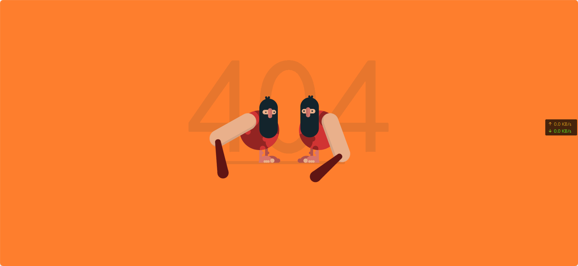
动态404页面 AI摘要:创建了一个动态的404页面,包含两个山顶洞人形象,通过HTML和CSS实现,包含动画效果。效果图 000030图片 演示站点-404 代码 代码 - HTML <!DOCTYPE html> <html lang="cn" > <head> <meta charset="UTF-8"> <title>404 error</title> <link rel="stylesheet" href="1.css"> </head> <body> <div class="text"><p>404</p></div> <div class="container"> <div class="caveman"> <div class="leg"> <div class="foot"><div class="fingers"></div></div> </div> <div class="leg"> <div class="foot"><div class="fingers"></div></div> </div> <div class="shape"> <div class="circle"></div> <div class="circle"></div> </div> <div class="head"> <div class="eye"><div class="nose"></div></div> <div class="mouth"></div> </div> <div class="arm-right"><div class="club"></div></div> </div> <div class="caveman"> <div class="leg"> <div class="foot"><div class="fingers"></div></div> </div> <div class="leg"> <div class="foot"><div class="fingers"></div></div> </div> <div class="shape"> <div class="circle"></div> <div class="circle"></div> </div> <div class="head"> <div class="eye"><div class="nose"></div></div> <div class="mouth"></div> </div> <div class="arm-right"><div class="club"></div></div> </div> </div> </body> </html> CSS body { background-color: #FF7F2E; font-family: "Concert One", cursive; margin: 0; overflow: hidden; padding: 0; } /*/////////////////// 规则 */ /*/////////////////// 场景 */ .text { left: 50%; position: absolute; top: 50%; transform: translate(-50%, -50%); color: rgba(19, 36, 44, 0.1); font-size: 30em; text-align: center; top: 40%; } .container { left: 50%; position: absolute; top: 50%; transform: translate(-50%, -50%); height: 300px; width: 500px; } .container:after { position: absolute; content: ""; background-color: rgba(19, 36, 44, 0.1); border-radius: 12px; bottom: 40px; height: 12px; left: 80px; width: 350px; z-index: -1; } /*/////////////////// 山顶洞人 */ .caveman { height: 300px; position: absolute; width: 250px; } .caveman:nth-child(1) { right: 20px; } .caveman:nth-child(2) { left: 20px; transform: rotateY(180deg); } .head { position: absolute; background-color: #13242C; border-radius: 50px; height: 140px; left: 60px; top: 25px; width: 65px; } .head:after, .head:before { content: ""; position: absolute; background-color: #13242C; border-radius: 10px; height: 20px; width: 7px; } .head:after { left: 35px; top: -8px; transform: rotate(20deg); } .head:before { left: 30px; top: -8px; transform: rotate(-20deg); } .head .eye { left: 50%; position: absolute; transform: translateX(-50%); background-color: #EAB08C; border-radius: 50px; height: 16px; left: 45%; top: 40px; width: 48px; } .head .eye:after, .head .eye:before { content: ""; position: absolute; top: 50%; transform: translateY(-50%); background-color: #13242C; border-radius: 50%; height: 5px; width: 5px; } .head .eye:after { left: 5px; } .head .eye:before { right: 9px; } .head .eye .nose { left: 50%; position: absolute; top: 50%; transform: translate(-50%, -50%); background-color: #D9766C; border-left: 8px solid rgba(19, 36, 44, 0.1); border-radius: 10px; box-sizing: border-box; height: 35px; left: 45%; top: 12px; width: 15px; } .shape { left: 50%; position: absolute; transform: translateX(-50%); border-radius: 50%; height: 140px; overflow: hidden; top: 70px; width: 140px; } .shape .circle { position: absolute; border-radius: 50%; height: 60px; width: 60px; } .shape .circle:after, .shape .circle:before { content: ""; position: absolute; border-radius: 50%; height: 20px; width: 20px; } .shape .circle:after { left: 50px; top: 10px; } .shape .circle:before { left: 60px; top: 45px; } .shape .circle:nth-child(1) { left: -12px; top: 80px; } .shape .circle:nth-child(2) { right: 10px; top: 0px; transform: rotate(90deg); } .shape .circle:nth-child(2):after { left: 65px; top: 10px; } .shape .circle:nth-child(2):before { display: none; } .caveman:nth-child(1) .shape { background-color: #D13433; } .caveman:nth-child(1) .shape .circle { background-color: #932422; } .caveman:nth-child(1) .shape .circle:after, .caveman:nth-child(1) .shape .circle:before { background-color: #932422; } .caveman:nth-child(2) .shape { background-color: #932422; } .caveman:nth-child(2) .shape .circle { background-color: #D13433; } .caveman:nth-child(2) .shape .circle:after, .caveman:nth-child(2) .shape .circle:before { background-color: #D13433; } .arm-right { position: absolute; background-color: #EAB08C; border-left: 8px solid rgba(19, 36, 44, 0.1); border-radius: 50px; box-sizing: border-box; height: 180px; left: 135px; top: 80px; transform-origin: 30px 30px; width: 60px; z-index: 1; } .arm-right .club { position: absolute; border-bottom: 110px solid #601513; border-left: 10px solid transparent; border-right: 10px solid transparent; height: 0; left: -60px; top: 120px; transform: rotate(70deg); width: 20px; } .arm-right .club:after, .arm-right .club:before { position: absolute; content: ""; background-color: #601513; border-radius: 50%; left: 0; } .arm-right .club:after { height: 20px; width: 20px; top: -10px; } .arm-right .club:before { height: 40px; width: 40px; left: -10px; top: 90px; } .leg { position: absolute; border-radius: 10px; height: 55px; top: 200px; width: 10px; } .leg:after { position: absolute; content: ""; border-radius: 50%; height: 10px; left: -5px; top: 15px; width: 10px; } .leg .foot { position: absolute; border-radius: 25px 25px 0 0; height: 25px; left: -38px; top: 30px; width: 50px; } .leg .foot:after, .leg .foot:before, .leg .foot .fingers, .leg .foot .fingers:after { position: absolute; background-color: #EAB08C; border-radius: 50%; bottom: 0px; height: 15px; transform-origin: bottom; width: 15px; } .leg .foot:after { left: -6px; content: ""; } .leg .foot:before { left: 8px; transform: scale(0.6); content: ""; } .leg .foot .fingers { left: 15px; transform: scale(0.6); } .leg .foot .fingers:after { left: 11px; content: ""; } .leg:nth-child(1) { background-color: #B2524D; left: 95px; } .leg:nth-child(1):after { background-color: #B2524D; } .leg:nth-child(1) .foot { background-color: #B2524D; } .leg:nth-child(1) .foot:after { background-color: #B2524D; } .leg:nth-child(1) .foot:before { display: none; } .leg:nth-child(2) { background-color: #D9766C; left: 115px; } .leg:nth-child(2):after { background-color: #D9766C; } .leg:nth-child(2) .foot { background-color: #D9766C; } /*/////////////////// 动画 */ .caveman:nth-child(1) .arm-right { animation: arm-anima 1.2s infinite cubic-bezier(0.55, 0.01, 0.16, 1.34); } .caveman:nth-child(2) .arm-right { animation: arm-anima 1.2s infinite cubic-bezier(0.55, 0.01, 0.16, 1.34); animation-delay: 0.6s; } @keyframes arm-anima { 0% { transform: rotate(0); } 100% { transform: rotate(-360deg); } } .caveman:nth-child(2) .head { animation: head-anima 1.2s infinite cubic-bezier(0.55, 0.01, 0.16, 1.34); } .caveman:nth-child(1) .head { animation: head-anima 1.2s infinite cubic-bezier(0.55, 0.01, 0.16, 1.34); animation-delay: 0.6s; } @keyframes head-anima { 0% { top: 25px; } 42% { top: 25px; } 45% { top: 50px; } 100% { top: 25px; } } .caveman:nth-child(2) .eye:after, .caveman:nth-child(2) .eye:before { animation: eye-anima 1.2s infinite cubic-bezier(0.55, 0.01, 0.16, 1.34); } .caveman:nth-child(1) .eye:after, .caveman:nth-child(1) .eye:before { animation: eye-anima 1.2s infinite cubic-bezier(0.55, 0.01, 0.16, 1.34); animation-delay: 0.6s; } @keyframes eye-anima { 0% { height: 5px; } 42% { height: 5px; } 45% { height: 1px; } 100% { height: 5px; } } .container:after { animation: shadow-anima 1.2s infinite cubic-bezier(0.55, 0.01, 0.16, 1.34); animation-delay: 0.1s; } @keyframes shadow-anima { 0% { width: 350px; left: 80px; } 25% { width: 450px; left: 80px; } 50% { width: 350px; left: 80px; } 75% { width: 450px; left: 0px; } 100% { width: 350px; left: 80px; } } #link { bottom: 20px; color: #000; opacity: 0.2; display: flex; align-items: center; position: absolute; left: 50%; transform: translateX(-50%); } #link p { margin: 0; margin-left: 5px; } #link:hover { opacity: 1; }
-
将腾讯微云直链网盘使用[图床] AI摘要:本文介绍如何利用腾讯微云直链网盘作为免费图床,方便博客插入图片。步骤包括上传图片、分享并复制链接,最后获取图片链接。各位在写博客的时候会发现有的时候需要插入图片,但是有的博客主使用的是虚拟机搭建的博客,储存空间可能不足,这个时候就用到了图床 图床是互联网中存储图片的空间,可以将用户上传的图片托管在云端服务器上,并生成一个图片链接,用户可以使用这个链接在各个平台上进行分享。[但是想要大容量的云服务器或者使用COS云储,都是一笔不小的花销] 所以这篇文章就是帮助大家免去这个图床的费用 ⚠注:腾讯微云只可用来做图床存储图片,视频暂时还不可以 教程如下: 打开腾讯微云 选择上传图片 上传完成后,选择分享[复制链接,或者选择浏览器打开] 000028图片 然后打开链接 长按图片或者单击右键,选择图片链接[这个时候的到的链接就是这个图片的链接] 000029图片 图片


![将腾讯微云直链网盘使用[图床]](https://www.xunjinlu.fun/img/000027.png)