找到
31
篇与
技术教程
相关的结果
- 第 4 页
-
 社会主义核心价值观-代码 AI摘要:本文介绍了社会主义核心价值观的代码实现,包括HTML代码,展示了国家、社会和个人层面的价值观内容,强调践行这些价值观对国家富强、社会和谐和个人全面发展的意义。效果图 000043图片 演示地址 代码 HTML代码 - <!DOCTYPE html> <html lang="zh-CN"> <head> <meta charset="UTF-8"> <meta name="viewport" content="width=device-width, initial-scale=1.0"> <title>社会主义核心价值观</title> <link href="http://api.xunjinlu.fun/css/shehuizhuyihexinjiazhiguan.css" rel="stylesheet"> <style> body { font-family: 'Noto Sans SC', Arial, sans-serif; margin: 0; padding: 0; background-color: #ffffff; color: #333; display: flex; justify-content: center; align-items: center; min-height: 100vh; flex-direction: column; } .container { max-width: 800px; padding: 20px; background-color: #ffffff; box-shadow: 0 2px 10px rgba(0, 0, 0, 0.1); border: 3px solid #d32f2f; border-radius: 10px; } h1 { color: #d32f2f; text-align: center; margin-bottom: 20px; font-size: 2.5em; } h2 { color: #b71c1c; margin-top: 20px; margin-bottom: 10px; border-bottom: 2px solid #b71c1c; padding-bottom: 5px; font-size: 1.8em; } p { line-height: 1.8; margin-bottom: 15px; font-size: 1.2em; } .values { display: flex; justify-content: space-around; margin-top: 20px; margin-bottom: 20px; flex-wrap: wrap; /* 允许内容换行 */ } .values div { text-align: center; width: 30%; background-color: #fbe9e7; border: 2px solid #b71c1c; border-radius: 10px; padding: 10px; box-shadow: 0 4px 6px rgba(0, 0, 0, 0.1); margin-bottom: 20px; /* 增加块之间的间距 */ transition: transform 0.3s; } @media (max-width: 768px) { .values div { width: 100%; /* 在手机界面上每个块占据整个行 */ } } .footer { text-align: center; padding: 15px; margin-top: 20px; color: #fff; background-color: #d32f2f; border-top: 3px solid #b71c1c; border-radius: 0 0 10px 10px; font-size: 1.2em; } .footer p { margin: 5px 0; } .footer small { display: block; margin-top: 10px; font-size: 0.9em; color: #f0f0f0; } </style> </head> <body> <div class="container"> <h1>社会主义核心价值观</h1> <p>社会主义核心价值观是中国共产党在新时期提出的重要指导思想,是社会主义现代化建设的重要精神<a href="/"target="_blank" style="color:#17202a;text-decoration: none;">支</a>柱。每个公民应当积极践行社会主义核心价值观,共建美好社会。</p> <h2>核心价值观内容</h2> <div class="values"> <div> <h3><a href="/" target="_blank" style="color: #d32f2f;text-decoration: none;">国家层面</a></h3> <p>富强、民主、文明、和谐</p> </div> <div> <h3><a href="/" target="_blank" style="color: #d32f2f;text-decoration: none;">社会层面</a></h3> <p>自由、平等、公正、法治</p> </div> <div> <h3><a href="/" target="_blank" style="color: #d32f2f;text-decoration: none;">个人层面</a></h3> <p>爱国、敬业、诚信、友善</p> </div> </div> <h2>应用和意义</h2> <p>社会主义核心价值观是每个公民应当遵循的道德准则,有助于推动国家富强,社会和谐,个人全面发展。通过践行这些价值观,我们可以共同为实现中华民族伟大复兴的中国梦贡献力量。</p> <div class="footer"> <p>践行社会主义核心价值观,共建美好未来</p> <small>© 2024 尋鯨錄 <br> <a href="https://beian.miit.gov.cn/" target="_blank" style="color: #f0f0f0;text-decoration: none;">滇ICP备2023007716号-1</a> <br> <a href="https://beian.mps.gov.cn/#/query/webSearch" target="_blank" style="color: white; text-decoration: none;"> <img src="https://beian.mps.gov.cn/img/logo01.dd7ff50e.png" alt="公安备案图标" style="vertical-align: middle; height: 15px; width: auto; margin-right: 5px;">公安备案号:滇公网安备53032202530370号</a> </small> </div> </div> </body> </html> 演示地址
-
Typecho 文章生成 AI 摘要 ( AISummary ) AI摘要:发现Typecho插件AISummary,解决原版问题,支持免费API调用,提供改版插件下载。 前段时间在寻找博客ai插件的时候发现了两款适用于typecho插件(AISummary 和 AIContentSummary),发现大多数博主都是用的AISummary,所以话不多说接下来看效果图: 效果图 000040图片 Github 开源地址 AISummary :https://github.com/idealclover/AISummary-Typecho AIContentSummary :https://github.com/Rockytkg/AIContentSummary AISummary AISummary的原版本个人感觉有一点点小问题,可能是跟我的其他插件有冲突,每次点击发布文章都需要加载半天,还加载不出来$[经典表情]::(流泪) 所以,这篇文章是一个小改的AISummary插件 打开插件下的 Plugin.php 文件 找到大约 223 行。 // $apiUrl = rtrim($options->apiUrl, '/') . '/v1/chat/completions'; 原代码,注释掉,然后添加下一行代码 $apiUrl = $options->apiUrl; 这里改变的原因就是原版插件只可以调用MoonShot Kimi Chat,不过Kimi只有新人15元免费,后面都需要收费()直到后面发现了智谱清言的 GLM-4-Flash 模型是完全免费的。) MoonShot Kimi Chat API KEY 注册地址: https://platform.moonshot.cn/ 智谱清言 BigModel智谱AI大模型开放平台链接: https://maas.aminer.cn/ GLM-4-Flash免费调用: 智谱AI首个免费API,零成本调用大模型,支持128K上下文。 修改后的插件配置 kimi Chat 模型名:moonshot-v1-8k 密钥:sk-9rvpKLaC5jPszkxdinwlSC6hHon*********** API地址:https://api.moonshot.cn/v1/chat/completions 智谱清言 模型名:glm-4-flash 密钥:95ee48bda0293d818967561af0d9e0.3whX********* API地址:https://open.bigmodel.cn/api/paas/v4/chat/completions 两个都是可以使用 最后没有动手能力的,可以直接下载改版插件 插件下载-改版
-
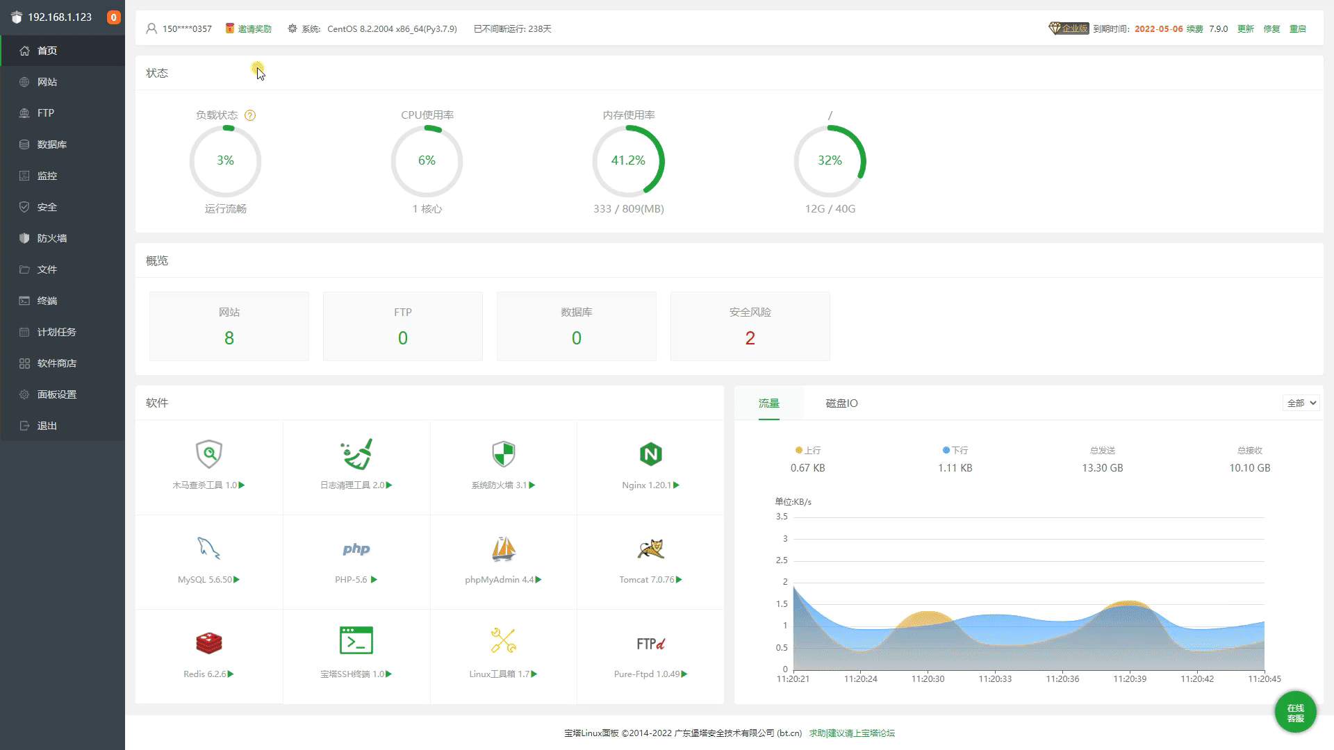
宝塔面板-开心版 AI摘要:宝塔面板开心版更新,修复多个插件安装错误,优化授权机制和本地插件使用,新增自动登录功能。支持Centos、Ubuntu、Debian、Fedora等系统安装。宝塔图片 话不多说先看效果图 000038图片 000039图片 开新版更新记录 内容如下 Node项目:未安装插件时报错而不是显示未安装 SSH系统账号管理:未安装插件时报错而不是显示列表为空 入侵防御:未安装插件时报错而不是显示未安装 PHP网站安全:未安装插件时报错而不是显示未安装 优化授权机制,修复监控版本防火墙时不时失效问题! 更新已知的插件版本 修复已知的bug 优化本地列表:云端列表连不上的时候会优先读取本地列表而不会出现商店无法使用但无法安装新插件 优化本地插件:云端连不上以及插件无法安装的时候,本地已经安装的插件可以正常打开使用而不会走云端 现在开始全新安装或者掉登录无需重新执行升级脚本或者去登录,直接重启面板会自动生产随机号码自动登录(已经把代码写在了授权文件里了,相当于再也不用登录了) 警告提示 宝塔官网 安装命令 Centos安装命令: yum install -y wget && wget -O install.sh http://io.bt.sb/install/install_6.0.sh && sh install.shUbuntu Deepin安装命令: wget -O install.sh http://io.bt.sb/install/install-ubuntu_6.0.sh && sudo bash install.shDebian安装命令: wget -O install.sh http://io.bt.sb/install/install-ubuntu_6.0.sh && bash install.shFedora安装命令: wget -O install.sh http://io.bt.sb/install/install_6.0.sh && bash install.sh 通用安装命令: if [ -f /usr/bin/curl ];then curl -sSO http://io.bt.sb/install/install_panel.sh;else wget -O install_panel.sh http://io.bt.sb/install/install_panel.sh;fi;bash install_panel.sh通用安装命令,基本适用上面的几个系统! 通用升级命令 Linux面板 9.2.0 升级企业版命令(所有官方版 / 开心版 包括低版本 都可以执行这个升级到 9.2.0 开心版): curl https://io.bt.sb/install/update_panel.sh|bash 最后感谢ADS的无偿贡献
-
聚光灯效果-HTML AI摘要:本文介绍了如何使用HTML和CSS实现聚光灯效果,通过设置背景渐变和裁剪路径,使文字产生动态的聚光灯效果。效果图 000032图片 代码 HTML+CSS - html <!DOCTYPE html> <html lang="zh-CN"> <head> <meta charset="UTF-8" /> <meta name="viewport" content="width=device-width, initial-scale=1.0" /> <title>HTML+CSS — 聚光灯</title> <link rel="stylesheet" href="index.css" /> </head> <body> <h1>Happy Birthday</h1> </body> </html> css * { padding: 0; margin: 0; } body { display: flex; justify-content: center; align-items: center; height: 100vh; background-color: #000; } h1 { position: relative; /* 1rem=16px */ font-size: 8rem; color: #333; } h1:after { content: 'Happy Birthday'; position: absolute; top: 0; left: 0; /* 透明色 */ color: transparent; background-image: linear-gradient(to right, #c23616, #192a56, #00d2d3, yellow, #6d214f, #2e86de,#4cd137, #e84118); /* 背景绘制区域,值为text时,给文字设置镂空效果,前提必须是文字颜色为透明色 */ background-clip: text; /* 谷歌浏览器私有属性 */ -webkit-background-clip: text; /* 使用裁切方法创建元素的可显示区域 circle表示裁切一个圆形 100px表示圆的直径 0%和50%表示圆心位置 直径和圆心两组值中间用at隔开*/ clip-path: circle(100px at 0% 50%); -webkit-clip-path: circle(100px at 0% 50%); animation: move 5s infinite; } @keyframes move { 0% { clip-path: circle(100px at 0% 50%); -webkit-clip-path: circle(100px at 0% 50%); } 50% { clip-path: circle(100px at 100% 50%); -webkit-clip-path: circle(100px at 100% 50%); } 100% { clip-path: circle(100px at 0% 50%); -webkit-clip-path: circle(100px at 0% 50%); } }
-
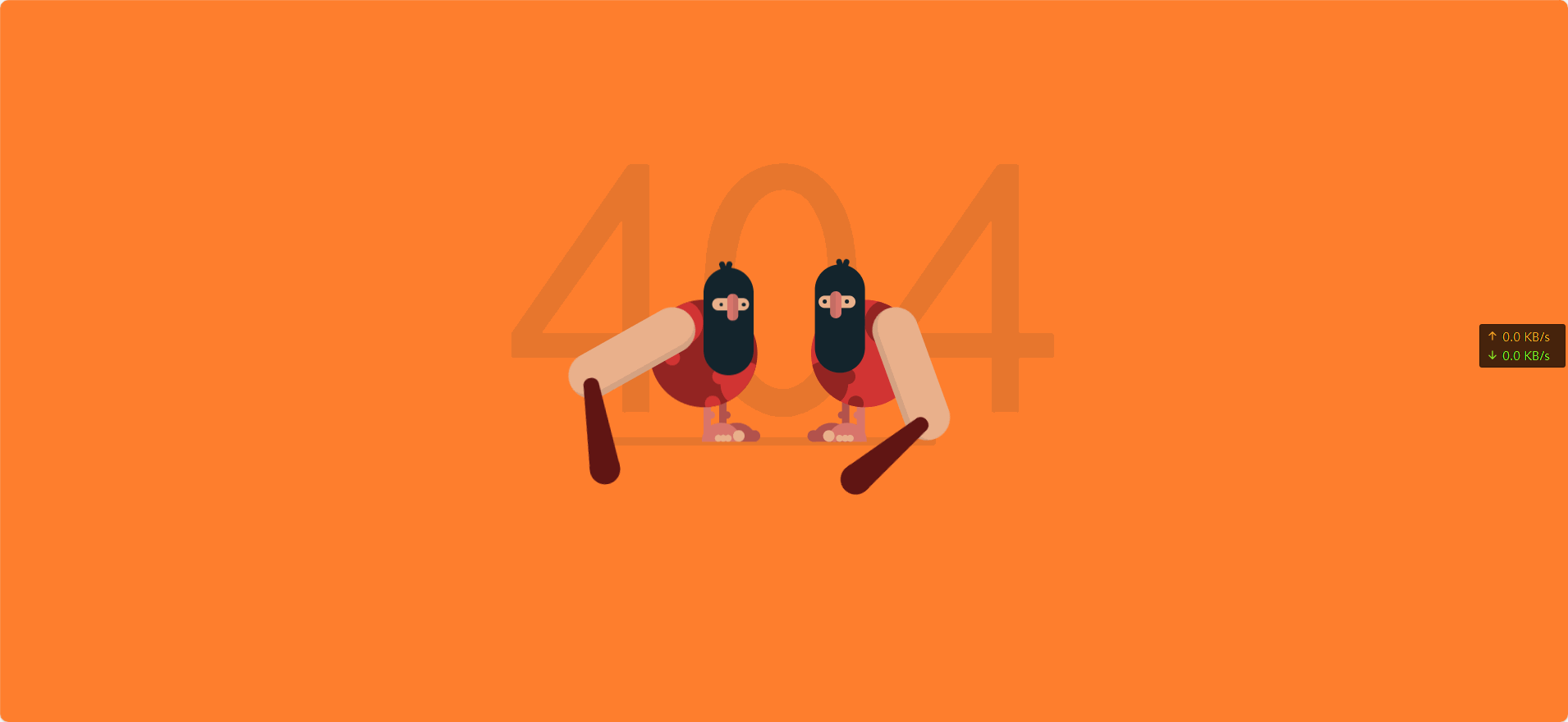
动态404页面 AI摘要:创建了一个动态的404页面,包含两个山顶洞人形象,通过HTML和CSS实现,包含动画效果。效果图 000030图片 演示站点-404 代码 代码 - HTML <!DOCTYPE html> <html lang="cn" > <head> <meta charset="UTF-8"> <title>404 error</title> <link rel="stylesheet" href="1.css"> </head> <body> <div class="text"><p>404</p></div> <div class="container"> <div class="caveman"> <div class="leg"> <div class="foot"><div class="fingers"></div></div> </div> <div class="leg"> <div class="foot"><div class="fingers"></div></div> </div> <div class="shape"> <div class="circle"></div> <div class="circle"></div> </div> <div class="head"> <div class="eye"><div class="nose"></div></div> <div class="mouth"></div> </div> <div class="arm-right"><div class="club"></div></div> </div> <div class="caveman"> <div class="leg"> <div class="foot"><div class="fingers"></div></div> </div> <div class="leg"> <div class="foot"><div class="fingers"></div></div> </div> <div class="shape"> <div class="circle"></div> <div class="circle"></div> </div> <div class="head"> <div class="eye"><div class="nose"></div></div> <div class="mouth"></div> </div> <div class="arm-right"><div class="club"></div></div> </div> </div> </body> </html> CSS body { background-color: #FF7F2E; font-family: "Concert One", cursive; margin: 0; overflow: hidden; padding: 0; } /*/////////////////// 规则 */ /*/////////////////// 场景 */ .text { left: 50%; position: absolute; top: 50%; transform: translate(-50%, -50%); color: rgba(19, 36, 44, 0.1); font-size: 30em; text-align: center; top: 40%; } .container { left: 50%; position: absolute; top: 50%; transform: translate(-50%, -50%); height: 300px; width: 500px; } .container:after { position: absolute; content: ""; background-color: rgba(19, 36, 44, 0.1); border-radius: 12px; bottom: 40px; height: 12px; left: 80px; width: 350px; z-index: -1; } /*/////////////////// 山顶洞人 */ .caveman { height: 300px; position: absolute; width: 250px; } .caveman:nth-child(1) { right: 20px; } .caveman:nth-child(2) { left: 20px; transform: rotateY(180deg); } .head { position: absolute; background-color: #13242C; border-radius: 50px; height: 140px; left: 60px; top: 25px; width: 65px; } .head:after, .head:before { content: ""; position: absolute; background-color: #13242C; border-radius: 10px; height: 20px; width: 7px; } .head:after { left: 35px; top: -8px; transform: rotate(20deg); } .head:before { left: 30px; top: -8px; transform: rotate(-20deg); } .head .eye { left: 50%; position: absolute; transform: translateX(-50%); background-color: #EAB08C; border-radius: 50px; height: 16px; left: 45%; top: 40px; width: 48px; } .head .eye:after, .head .eye:before { content: ""; position: absolute; top: 50%; transform: translateY(-50%); background-color: #13242C; border-radius: 50%; height: 5px; width: 5px; } .head .eye:after { left: 5px; } .head .eye:before { right: 9px; } .head .eye .nose { left: 50%; position: absolute; top: 50%; transform: translate(-50%, -50%); background-color: #D9766C; border-left: 8px solid rgba(19, 36, 44, 0.1); border-radius: 10px; box-sizing: border-box; height: 35px; left: 45%; top: 12px; width: 15px; } .shape { left: 50%; position: absolute; transform: translateX(-50%); border-radius: 50%; height: 140px; overflow: hidden; top: 70px; width: 140px; } .shape .circle { position: absolute; border-radius: 50%; height: 60px; width: 60px; } .shape .circle:after, .shape .circle:before { content: ""; position: absolute; border-radius: 50%; height: 20px; width: 20px; } .shape .circle:after { left: 50px; top: 10px; } .shape .circle:before { left: 60px; top: 45px; } .shape .circle:nth-child(1) { left: -12px; top: 80px; } .shape .circle:nth-child(2) { right: 10px; top: 0px; transform: rotate(90deg); } .shape .circle:nth-child(2):after { left: 65px; top: 10px; } .shape .circle:nth-child(2):before { display: none; } .caveman:nth-child(1) .shape { background-color: #D13433; } .caveman:nth-child(1) .shape .circle { background-color: #932422; } .caveman:nth-child(1) .shape .circle:after, .caveman:nth-child(1) .shape .circle:before { background-color: #932422; } .caveman:nth-child(2) .shape { background-color: #932422; } .caveman:nth-child(2) .shape .circle { background-color: #D13433; } .caveman:nth-child(2) .shape .circle:after, .caveman:nth-child(2) .shape .circle:before { background-color: #D13433; } .arm-right { position: absolute; background-color: #EAB08C; border-left: 8px solid rgba(19, 36, 44, 0.1); border-radius: 50px; box-sizing: border-box; height: 180px; left: 135px; top: 80px; transform-origin: 30px 30px; width: 60px; z-index: 1; } .arm-right .club { position: absolute; border-bottom: 110px solid #601513; border-left: 10px solid transparent; border-right: 10px solid transparent; height: 0; left: -60px; top: 120px; transform: rotate(70deg); width: 20px; } .arm-right .club:after, .arm-right .club:before { position: absolute; content: ""; background-color: #601513; border-radius: 50%; left: 0; } .arm-right .club:after { height: 20px; width: 20px; top: -10px; } .arm-right .club:before { height: 40px; width: 40px; left: -10px; top: 90px; } .leg { position: absolute; border-radius: 10px; height: 55px; top: 200px; width: 10px; } .leg:after { position: absolute; content: ""; border-radius: 50%; height: 10px; left: -5px; top: 15px; width: 10px; } .leg .foot { position: absolute; border-radius: 25px 25px 0 0; height: 25px; left: -38px; top: 30px; width: 50px; } .leg .foot:after, .leg .foot:before, .leg .foot .fingers, .leg .foot .fingers:after { position: absolute; background-color: #EAB08C; border-radius: 50%; bottom: 0px; height: 15px; transform-origin: bottom; width: 15px; } .leg .foot:after { left: -6px; content: ""; } .leg .foot:before { left: 8px; transform: scale(0.6); content: ""; } .leg .foot .fingers { left: 15px; transform: scale(0.6); } .leg .foot .fingers:after { left: 11px; content: ""; } .leg:nth-child(1) { background-color: #B2524D; left: 95px; } .leg:nth-child(1):after { background-color: #B2524D; } .leg:nth-child(1) .foot { background-color: #B2524D; } .leg:nth-child(1) .foot:after { background-color: #B2524D; } .leg:nth-child(1) .foot:before { display: none; } .leg:nth-child(2) { background-color: #D9766C; left: 115px; } .leg:nth-child(2):after { background-color: #D9766C; } .leg:nth-child(2) .foot { background-color: #D9766C; } /*/////////////////// 动画 */ .caveman:nth-child(1) .arm-right { animation: arm-anima 1.2s infinite cubic-bezier(0.55, 0.01, 0.16, 1.34); } .caveman:nth-child(2) .arm-right { animation: arm-anima 1.2s infinite cubic-bezier(0.55, 0.01, 0.16, 1.34); animation-delay: 0.6s; } @keyframes arm-anima { 0% { transform: rotate(0); } 100% { transform: rotate(-360deg); } } .caveman:nth-child(2) .head { animation: head-anima 1.2s infinite cubic-bezier(0.55, 0.01, 0.16, 1.34); } .caveman:nth-child(1) .head { animation: head-anima 1.2s infinite cubic-bezier(0.55, 0.01, 0.16, 1.34); animation-delay: 0.6s; } @keyframes head-anima { 0% { top: 25px; } 42% { top: 25px; } 45% { top: 50px; } 100% { top: 25px; } } .caveman:nth-child(2) .eye:after, .caveman:nth-child(2) .eye:before { animation: eye-anima 1.2s infinite cubic-bezier(0.55, 0.01, 0.16, 1.34); } .caveman:nth-child(1) .eye:after, .caveman:nth-child(1) .eye:before { animation: eye-anima 1.2s infinite cubic-bezier(0.55, 0.01, 0.16, 1.34); animation-delay: 0.6s; } @keyframes eye-anima { 0% { height: 5px; } 42% { height: 5px; } 45% { height: 1px; } 100% { height: 5px; } } .container:after { animation: shadow-anima 1.2s infinite cubic-bezier(0.55, 0.01, 0.16, 1.34); animation-delay: 0.1s; } @keyframes shadow-anima { 0% { width: 350px; left: 80px; } 25% { width: 450px; left: 80px; } 50% { width: 350px; left: 80px; } 75% { width: 450px; left: 0px; } 100% { width: 350px; left: 80px; } } #link { bottom: 20px; color: #000; opacity: 0.2; display: flex; align-items: center; position: absolute; left: 50%; transform: translateX(-50%); } #link p { margin: 0; margin-left: 5px; } #link:hover { opacity: 1; }
