找到
60
篇与
尋鯨錄
相关的结果
- 第 7 页
-
 聚光灯效果-HTML AI摘要:本文介绍了如何使用HTML和CSS实现聚光灯效果,通过设置背景渐变和裁剪路径,使文字产生动态的聚光灯效果。效果图 000032图片 代码 HTML+CSS - html <!DOCTYPE html> <html lang="zh-CN"> <head> <meta charset="UTF-8" /> <meta name="viewport" content="width=device-width, initial-scale=1.0" /> <title>HTML+CSS — 聚光灯</title> <link rel="stylesheet" href="index.css" /> </head> <body> <h1>Happy Birthday</h1> </body> </html> css * { padding: 0; margin: 0; } body { display: flex; justify-content: center; align-items: center; height: 100vh; background-color: #000; } h1 { position: relative; /* 1rem=16px */ font-size: 8rem; color: #333; } h1:after { content: 'Happy Birthday'; position: absolute; top: 0; left: 0; /* 透明色 */ color: transparent; background-image: linear-gradient(to right, #c23616, #192a56, #00d2d3, yellow, #6d214f, #2e86de,#4cd137, #e84118); /* 背景绘制区域,值为text时,给文字设置镂空效果,前提必须是文字颜色为透明色 */ background-clip: text; /* 谷歌浏览器私有属性 */ -webkit-background-clip: text; /* 使用裁切方法创建元素的可显示区域 circle表示裁切一个圆形 100px表示圆的直径 0%和50%表示圆心位置 直径和圆心两组值中间用at隔开*/ clip-path: circle(100px at 0% 50%); -webkit-clip-path: circle(100px at 0% 50%); animation: move 5s infinite; } @keyframes move { 0% { clip-path: circle(100px at 0% 50%); -webkit-clip-path: circle(100px at 0% 50%); } 50% { clip-path: circle(100px at 100% 50%); -webkit-clip-path: circle(100px at 100% 50%); } 100% { clip-path: circle(100px at 0% 50%); -webkit-clip-path: circle(100px at 0% 50%); } }
-
2024 年 12 月 6 日,Friday,每日 60 秒读懂世界 AI摘要:2024年12月6日,发生多起事故和事件,包括中储粮倒塌事故、福州火灾、穿山甲药物管控、大学生艾滋病感染、菲律宾侵闯中国领海、春节申遗成功、琼瑶去世、美驱逐舰换装、欧洲航天合作、马斯克薪酬计划被驳回、日本放宽签证条件、刚果不明原因疾病、美国制裁伊朗、乌克兰停止俄天然气过境、韩国总统弹劾案等。1、3日下午,中储粮金乡县一项目发生拆除倒塌事故:致6人死亡1人重伤,1人被困正在救援中;2日晚,福州一居民楼发生火灾,当地:已致3人死亡,初查系电动车起火;2、三部门:严格穿山甲甲片入药,含穿山甲成分药物不得新增纳入医保;3、国家卫健委:4年间,大学生艾滋病感染1.2万例。专家呼吁加强防控!;4、4日,菲律宾派出海警船、公务船连同多艘渔船侵闯中国黄岩岛领海,中国海警:依法依规实施管控,由此引发的一切后果由菲方承担;5、4日,我国春节申遗成功!中国世界非遗总数达44项;6、台媒:4日下午,知名作家琼瑶在家中轻生身亡,享年86岁。留下遗书:摆脱逐渐让我痛苦的躯壳,“翩然“化为雪花飞去;7、美最强驱逐舰不惜血本搞“换装“:准备搭载高超音速导弹,对标中俄“快速进步压力“;8、外媒:为抗衡“星链“, 欧洲航天三巨头欲合力打造新卫星公司;9、美媒:马斯克讨薪失败,560亿美元(约人民币3642亿元)薪酬计划再遭驳回,马斯克:公司应当由股东而非法官控制;10、日媒:日本政府已开始协调放宽中国公民赴日签证申请条件,部分手续将得到简化;11、刚果(金)不明原因疾病已累计报告376人染病,至少79人死亡,死者多为青少年,症状包括头痛、发热、呼吸困难和贫血等;12、美国财政部宣布:对与伊朗石油运输有关的35个实体和船只实施制裁;13、乌方宣布:将停止俄天然气过境运输!德国总理:向乌克兰派兵“绝无可能“;14、韩执政党要求尹锡悦退党;韩国总统府首席秘书以上的高层幕僚,4日上午集体提出辞职。国国防部长官金龙显向总统递交辞呈。韩国6个在野党联合提起总统弹劾案,4日下午已提交国会,预计6日-7日将投票表决;15、韩媒:韩国被英美多国列为“旅行危险国家“;韩国最大工会发起“无限期罢工“,呼吁尹锡悦以煽动“内乱罪“辞职;【微语】人生很多事,就像智齿。最佳的解决方式,是拔掉。而不是,忍受。
-
二人皆是文圣一脉 AI摘要:本文讲述了两位文圣后裔的故事。{dplayer src="https://txmov2.a.kwimgs.com/upic/2024/11/16/12/BMjAyNDExMTYxMjA0MDhfMjkzOTM1NjQ4NV8xNDg3MzgwODYzNzdfMl8z_b_Bdf7be3fb4fbe9d9fd3df314e3029bdff.mp4" pic="https://p1.a.yximgs.com/upic/2024/11/16/12/BMjAyNDExMTYxMjA0MDhfMjkzOTM1NjQ4NV8xNDg3MzgwODYzNzdfMl8z_ccc_B7d90e2048bce388bb5523d1bf76663c9.jpg?tag=1-1733414507-xpcwebdetail-0-p6srw2eqcv-029b7b897c281569&clientCacheKey=3x8yugds47qcke2_ccc.jpg&di=JA4ETUJqrl9mg" theme="#ffffff" autoplay="1" loop="0" screenshot="1" /}
-
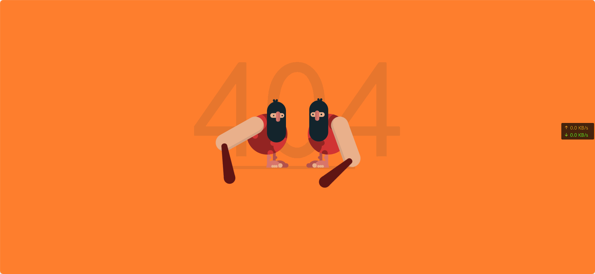
动态404页面 AI摘要:创建了一个动态的404页面,包含两个山顶洞人形象,通过HTML和CSS实现,包含动画效果。效果图 000030图片 演示站点-404 代码 代码 - HTML <!DOCTYPE html> <html lang="cn" > <head> <meta charset="UTF-8"> <title>404 error</title> <link rel="stylesheet" href="1.css"> </head> <body> <div class="text"><p>404</p></div> <div class="container"> <div class="caveman"> <div class="leg"> <div class="foot"><div class="fingers"></div></div> </div> <div class="leg"> <div class="foot"><div class="fingers"></div></div> </div> <div class="shape"> <div class="circle"></div> <div class="circle"></div> </div> <div class="head"> <div class="eye"><div class="nose"></div></div> <div class="mouth"></div> </div> <div class="arm-right"><div class="club"></div></div> </div> <div class="caveman"> <div class="leg"> <div class="foot"><div class="fingers"></div></div> </div> <div class="leg"> <div class="foot"><div class="fingers"></div></div> </div> <div class="shape"> <div class="circle"></div> <div class="circle"></div> </div> <div class="head"> <div class="eye"><div class="nose"></div></div> <div class="mouth"></div> </div> <div class="arm-right"><div class="club"></div></div> </div> </div> </body> </html> CSS body { background-color: #FF7F2E; font-family: "Concert One", cursive; margin: 0; overflow: hidden; padding: 0; } /*/////////////////// 规则 */ /*/////////////////// 场景 */ .text { left: 50%; position: absolute; top: 50%; transform: translate(-50%, -50%); color: rgba(19, 36, 44, 0.1); font-size: 30em; text-align: center; top: 40%; } .container { left: 50%; position: absolute; top: 50%; transform: translate(-50%, -50%); height: 300px; width: 500px; } .container:after { position: absolute; content: ""; background-color: rgba(19, 36, 44, 0.1); border-radius: 12px; bottom: 40px; height: 12px; left: 80px; width: 350px; z-index: -1; } /*/////////////////// 山顶洞人 */ .caveman { height: 300px; position: absolute; width: 250px; } .caveman:nth-child(1) { right: 20px; } .caveman:nth-child(2) { left: 20px; transform: rotateY(180deg); } .head { position: absolute; background-color: #13242C; border-radius: 50px; height: 140px; left: 60px; top: 25px; width: 65px; } .head:after, .head:before { content: ""; position: absolute; background-color: #13242C; border-radius: 10px; height: 20px; width: 7px; } .head:after { left: 35px; top: -8px; transform: rotate(20deg); } .head:before { left: 30px; top: -8px; transform: rotate(-20deg); } .head .eye { left: 50%; position: absolute; transform: translateX(-50%); background-color: #EAB08C; border-radius: 50px; height: 16px; left: 45%; top: 40px; width: 48px; } .head .eye:after, .head .eye:before { content: ""; position: absolute; top: 50%; transform: translateY(-50%); background-color: #13242C; border-radius: 50%; height: 5px; width: 5px; } .head .eye:after { left: 5px; } .head .eye:before { right: 9px; } .head .eye .nose { left: 50%; position: absolute; top: 50%; transform: translate(-50%, -50%); background-color: #D9766C; border-left: 8px solid rgba(19, 36, 44, 0.1); border-radius: 10px; box-sizing: border-box; height: 35px; left: 45%; top: 12px; width: 15px; } .shape { left: 50%; position: absolute; transform: translateX(-50%); border-radius: 50%; height: 140px; overflow: hidden; top: 70px; width: 140px; } .shape .circle { position: absolute; border-radius: 50%; height: 60px; width: 60px; } .shape .circle:after, .shape .circle:before { content: ""; position: absolute; border-radius: 50%; height: 20px; width: 20px; } .shape .circle:after { left: 50px; top: 10px; } .shape .circle:before { left: 60px; top: 45px; } .shape .circle:nth-child(1) { left: -12px; top: 80px; } .shape .circle:nth-child(2) { right: 10px; top: 0px; transform: rotate(90deg); } .shape .circle:nth-child(2):after { left: 65px; top: 10px; } .shape .circle:nth-child(2):before { display: none; } .caveman:nth-child(1) .shape { background-color: #D13433; } .caveman:nth-child(1) .shape .circle { background-color: #932422; } .caveman:nth-child(1) .shape .circle:after, .caveman:nth-child(1) .shape .circle:before { background-color: #932422; } .caveman:nth-child(2) .shape { background-color: #932422; } .caveman:nth-child(2) .shape .circle { background-color: #D13433; } .caveman:nth-child(2) .shape .circle:after, .caveman:nth-child(2) .shape .circle:before { background-color: #D13433; } .arm-right { position: absolute; background-color: #EAB08C; border-left: 8px solid rgba(19, 36, 44, 0.1); border-radius: 50px; box-sizing: border-box; height: 180px; left: 135px; top: 80px; transform-origin: 30px 30px; width: 60px; z-index: 1; } .arm-right .club { position: absolute; border-bottom: 110px solid #601513; border-left: 10px solid transparent; border-right: 10px solid transparent; height: 0; left: -60px; top: 120px; transform: rotate(70deg); width: 20px; } .arm-right .club:after, .arm-right .club:before { position: absolute; content: ""; background-color: #601513; border-radius: 50%; left: 0; } .arm-right .club:after { height: 20px; width: 20px; top: -10px; } .arm-right .club:before { height: 40px; width: 40px; left: -10px; top: 90px; } .leg { position: absolute; border-radius: 10px; height: 55px; top: 200px; width: 10px; } .leg:after { position: absolute; content: ""; border-radius: 50%; height: 10px; left: -5px; top: 15px; width: 10px; } .leg .foot { position: absolute; border-radius: 25px 25px 0 0; height: 25px; left: -38px; top: 30px; width: 50px; } .leg .foot:after, .leg .foot:before, .leg .foot .fingers, .leg .foot .fingers:after { position: absolute; background-color: #EAB08C; border-radius: 50%; bottom: 0px; height: 15px; transform-origin: bottom; width: 15px; } .leg .foot:after { left: -6px; content: ""; } .leg .foot:before { left: 8px; transform: scale(0.6); content: ""; } .leg .foot .fingers { left: 15px; transform: scale(0.6); } .leg .foot .fingers:after { left: 11px; content: ""; } .leg:nth-child(1) { background-color: #B2524D; left: 95px; } .leg:nth-child(1):after { background-color: #B2524D; } .leg:nth-child(1) .foot { background-color: #B2524D; } .leg:nth-child(1) .foot:after { background-color: #B2524D; } .leg:nth-child(1) .foot:before { display: none; } .leg:nth-child(2) { background-color: #D9766C; left: 115px; } .leg:nth-child(2):after { background-color: #D9766C; } .leg:nth-child(2) .foot { background-color: #D9766C; } /*/////////////////// 动画 */ .caveman:nth-child(1) .arm-right { animation: arm-anima 1.2s infinite cubic-bezier(0.55, 0.01, 0.16, 1.34); } .caveman:nth-child(2) .arm-right { animation: arm-anima 1.2s infinite cubic-bezier(0.55, 0.01, 0.16, 1.34); animation-delay: 0.6s; } @keyframes arm-anima { 0% { transform: rotate(0); } 100% { transform: rotate(-360deg); } } .caveman:nth-child(2) .head { animation: head-anima 1.2s infinite cubic-bezier(0.55, 0.01, 0.16, 1.34); } .caveman:nth-child(1) .head { animation: head-anima 1.2s infinite cubic-bezier(0.55, 0.01, 0.16, 1.34); animation-delay: 0.6s; } @keyframes head-anima { 0% { top: 25px; } 42% { top: 25px; } 45% { top: 50px; } 100% { top: 25px; } } .caveman:nth-child(2) .eye:after, .caveman:nth-child(2) .eye:before { animation: eye-anima 1.2s infinite cubic-bezier(0.55, 0.01, 0.16, 1.34); } .caveman:nth-child(1) .eye:after, .caveman:nth-child(1) .eye:before { animation: eye-anima 1.2s infinite cubic-bezier(0.55, 0.01, 0.16, 1.34); animation-delay: 0.6s; } @keyframes eye-anima { 0% { height: 5px; } 42% { height: 5px; } 45% { height: 1px; } 100% { height: 5px; } } .container:after { animation: shadow-anima 1.2s infinite cubic-bezier(0.55, 0.01, 0.16, 1.34); animation-delay: 0.1s; } @keyframes shadow-anima { 0% { width: 350px; left: 80px; } 25% { width: 450px; left: 80px; } 50% { width: 350px; left: 80px; } 75% { width: 450px; left: 0px; } 100% { width: 350px; left: 80px; } } #link { bottom: 20px; color: #000; opacity: 0.2; display: flex; align-items: center; position: absolute; left: 50%; transform: translateX(-50%); } #link p { margin: 0; margin-left: 5px; } #link:hover { opacity: 1; }
